earnings-regression
Earnings Regression
Does more schooling, or more years of work, mean a higher hourly wage? This fits a trend line through a public survey of American young people: move two sliders, schooling and experience, and it predicts a wage. The answer: those two facts barely predict anything. Tested on people it had never seen, it scores -0.008, slightly worse than guessing the average wage for everyone, reported rather than hidden.
Solo work by our founder, Salman Adnan.
Overview
A multivariable linear regression that predicts hourly earnings from years of schooling and years of work experience, using a 2,000-row subset of the NLSY97 (National Longitudinal Survey of Youth 1997-2011), served through an interactive Plotly/Flask dashboard as well as a plain headless script.
Key features
- Loads and cleans the NLSY97 subset (drops rows with missing values and duplicates), then fits a simple regression (earnings on schooling alone) and a multivariable regression (earnings on schooling and experience), reporting R-squared on both a training split and a held-out 20% test split.
- A live prediction panel: two sliders (schooling, experience) that call a
/predictAPI endpoint on every move and display the real model's output, not a hardcoded formula. - A Plotly scatter of actual vs. predicted earnings on the held-out test split, with a y = x reference line for perfect prediction.
- A 3D Plotly surface of predicted earnings across the entire schooling/experience plane, with the real training rows plotted on top of it as points.
- A residuals plot (predicted minus actual) against predicted earnings, plus a headless mode (
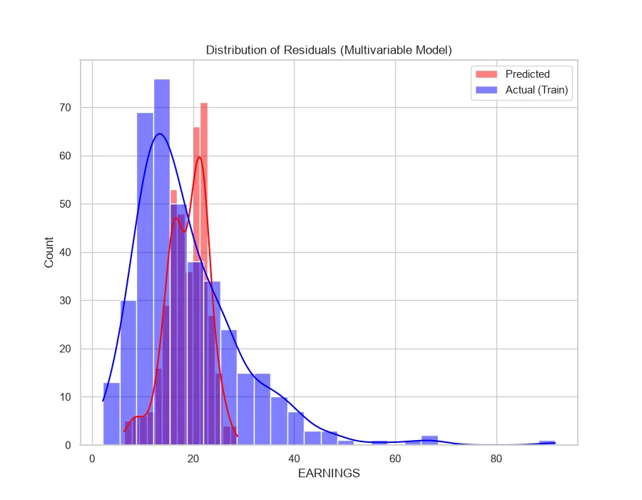
main.py) that still prints the same exploration output and writes the same two static PNGs it always did.
Verification
The prediction endpoint was hit directly and returned a real model output: {"experience":5.0,"predicted_earnings":20.29,"schooling":16.0} for 16 years of schooling and 5 years of experience. The multivariable model's held-out test R-squared came out at -0.008, meaning on this split it performs marginally worse than predicting the mean training earnings for everyone. That's reported as-is rather than hidden: with only two features and 492 usable rows after dropping missing values, the model isn't capturing much of what actually drives earnings.