space-race-analysis
Space Race Analysis
A study of every space launch on record from 1957 to 2020: 4,324 of them, flown by 56 organisations. It answers the questions people actually ask about spaceflight: who launches the most, what a launch costs, and how the USA and the USSR compared during the Cold War. It ships 17 charts plus a web page where you filter by country, organisation, or years and watch them redraw.
Solo work by our founder, Salman Adnan.
Overview
A data analysis script and interactive Flask dashboard covering every space mission launch on record from the start of the Space Race in 1957 through 2020: 4,324 launches by 56 organisations, cleaned and turned into 17 static charts plus a live-filterable dashboard covering launch counts, cost, geography, and the Cold War rivalry between the USA and the USSR.
Key features
- Cleans the scraped CSV: drops duplicate rows and two junk index columns, then parses free-text launch locations down to ISO country codes with a graceful fallback for defunct sites like former USSR launch pads.
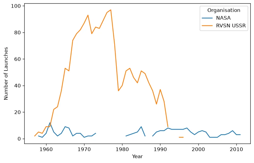
- 17 static charts: bar charts for launches per organisation/year/month, a price histogram, line charts for average price and launch cadence over time, a USA vs USSR pie chart, and two interactive Plotly charts (a world choropleth and a country-to-organisation sunburst).
- Every chart writes to
output/as a file (PNG or HTML), so the analysis is reproducible headless; an optionalSHOW_PLOTS=1toggle pops each one up interactively too. - A spend analysis across the 25 organisations that report both launch counts and a non-zero price, since most of the dataset never discloses cost.
- A Flask dashboard on the same cleaned data: filter by organisation, country, and launch-year range and watch five charts, including a real hover/zoom/click choropleth and sunburst, update live with no page reload.
Verification
A verified run of space_race_analysis.py writes 17 chart files (15 PNGs, 2 HTMLs) into output/, which ships in the repo as a sample of a completed run. The dashboard loads all 4,324 launches on start, and its "USA vs USSR (1957-1991)" shortcut computes a real number on the fly: 1,876 launches split 111 NASA to 1,765 RVSN USSR, not a hardcoded figure.